UBS
Designing a tool that a user has full control of their financial health
Role: Design lead
Challenges:
Provide users a seamless and intuitive experience.
Push the boundary of the existing UBS brand.
Avoid so many legal obstacles.
This UBS all-in-one solution gives a holistic view of financial states from banking to inventing to users. Starting from a tablet version(client's specific ask) to a desktop and a mobile, we designed a consistent and seamless UX/UI solution for this product. I was in charge of understanding UBS's brand DNA and molded it into this new product with an improved design language. I was leading its design for almost a year, from an early stage to deployment.
Original UBS Design
This is a design of their existing app.

Site Architecture
Since a structure underneath banking has so many complex systems and features that could be applied to various situations. We spent a handsome amount of our time figuring out the best way to organize and structure this information.

Modern and inviting visual with full of useful data.
We did many iteration to reach best possible option.

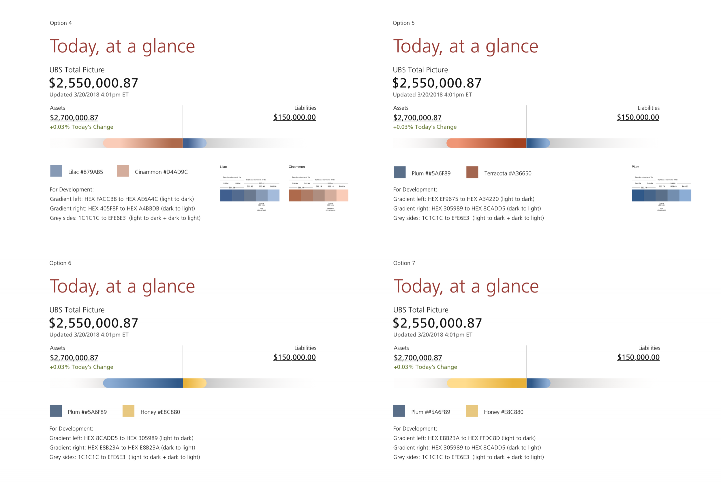
The color was a big thing. Carefully choose colors and combine those to see where are the perfect balance between many different variations.

Sign In
Beautiful and nice transition from the moment you are launching the app to the moment you land on the main screen.

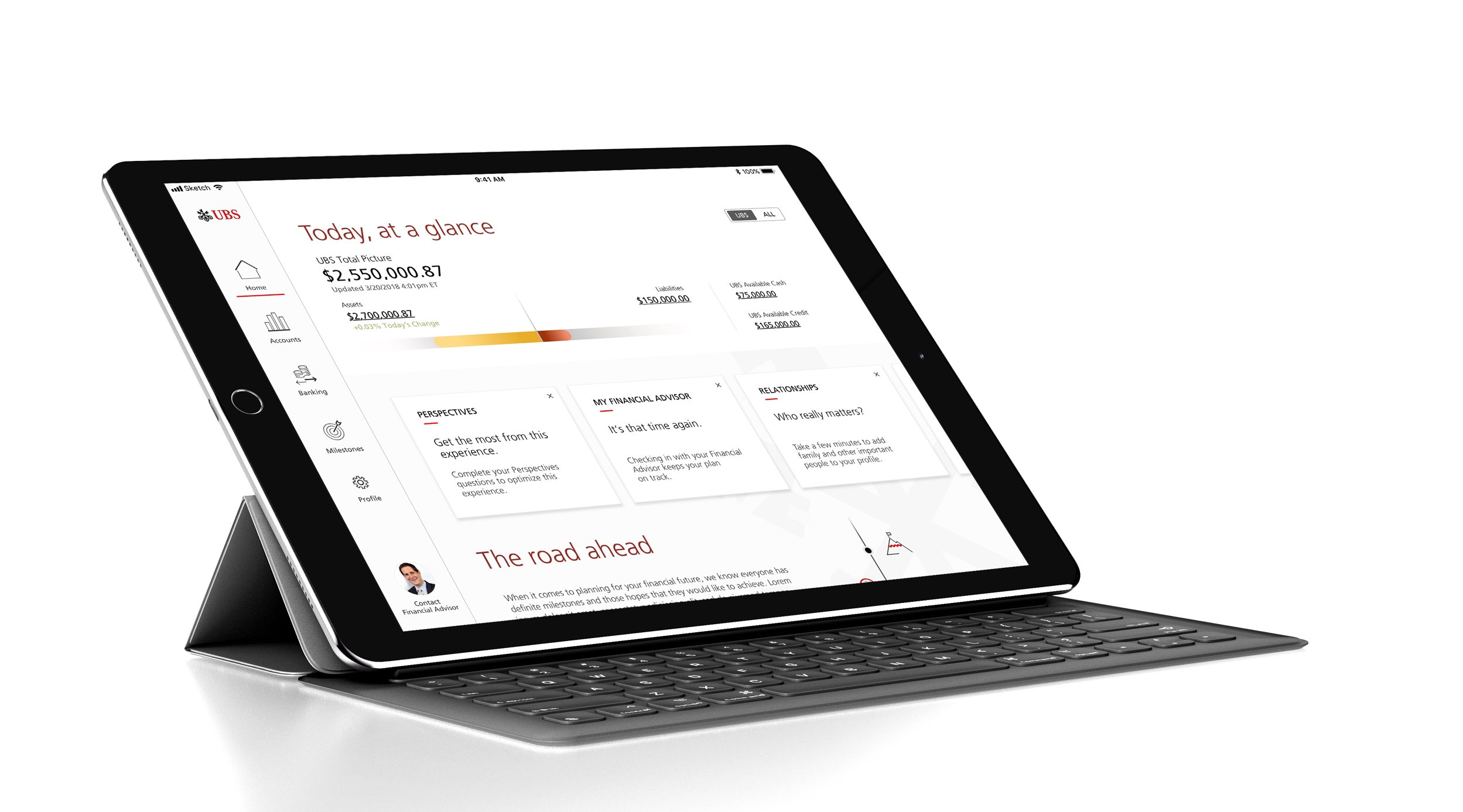
Main Page
The main page provides a user overview and quick access to
UBS accounts / External accounts
Insights and alerts
Milestones (Goals)
News and articles
Contact your advisor

Perspective Questions
In order to understand users' financial needs and wishes, this app asks questions to figure out what matters to the user. Also, the process of answering them is an easy and pleasing experience. Showing images that are relevant to questions. The way how elements are moving one to another gives delightfulness.

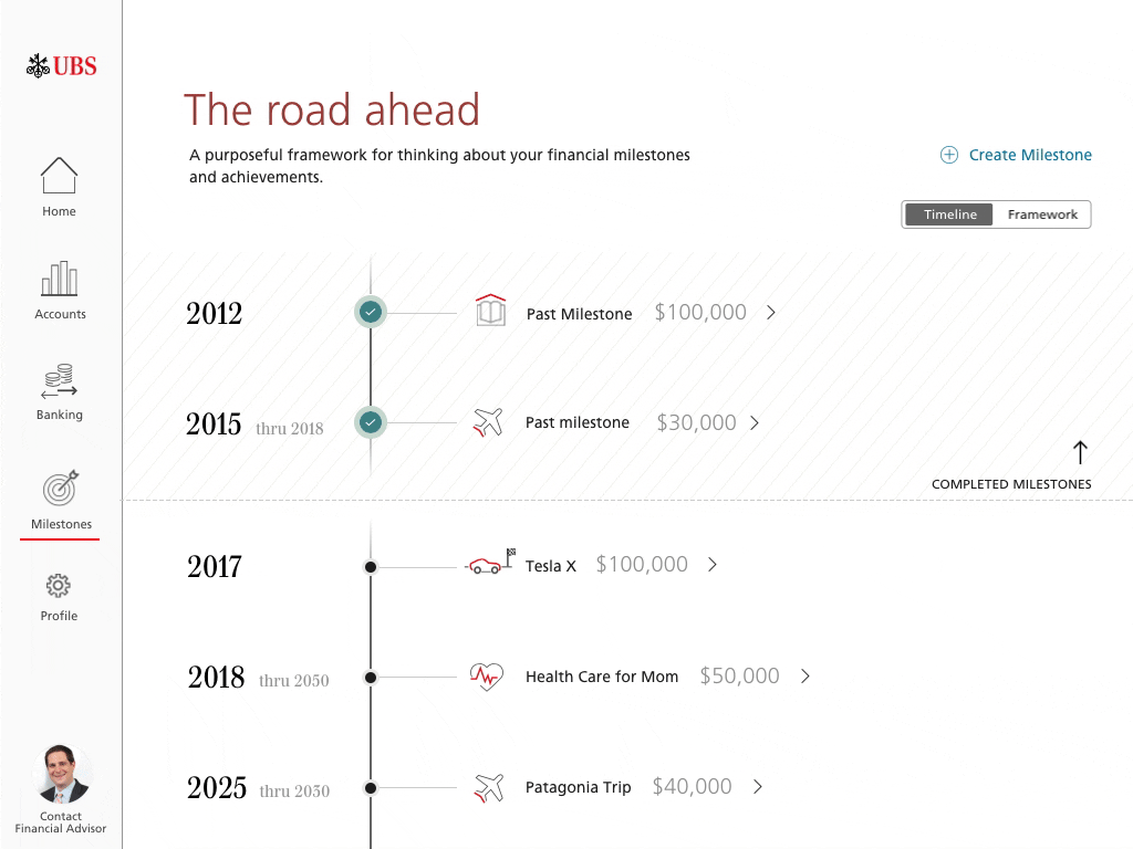
Milestones
From the main page or milestones page, users can access their milestone timeline easily. The vertical timeline allows users to look through milestones quickly. The Iconography provides delightfulness and working as a self-explanatory element.

Create a Milestone
From the milestone page or home page level, users can create a milestone. This process could be boring for the user, so it needed a more engaging way to do this, This process is very intuitive and interactive to motivate the user to create one without hassle.
